


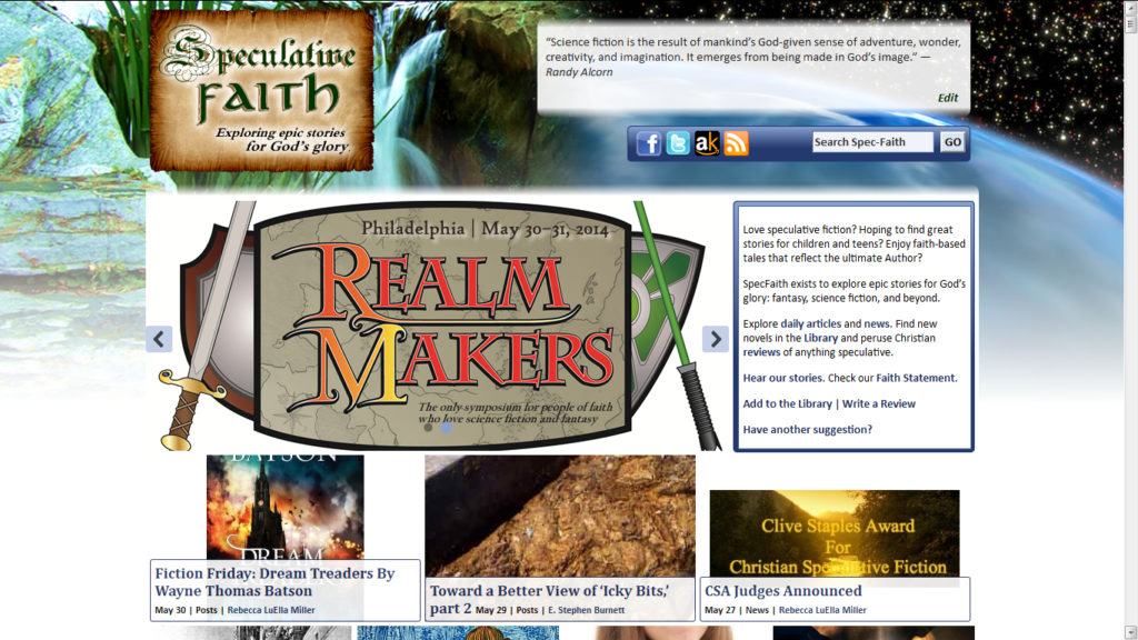
SpecFaith 2014: Site Beta Test
Today SpecFaith looks a little different; what do you think?
E. Stephen Burnett on May 30, 2014 · 17 comments

Just in time for Realm Makers and the Clive Staples Award 2014 winner announcement, today SpecFaith looks a little different.
The new site layout is a beta test.
It’s intended to help readers better see new articles, news items, Library books, and our Christian reviews of anything speculative.
Missing from the front page are a few things such as previews filled with text.
Added to the front page are a new widescreen banner, a welcome to SpecFaith, and shinier previews of all our most recent content.
Atop it all rises a more-prominent space for Christian-speculative quotes, and options for searching signing up to follow us on Facebook, Twitter, Amazon Kindle and RSS.
What do you think?


It’s too cluttered for the modern age. It looks “not 21st Century.” Looking forward to hearing who won.
I think the biggest face lift would be an updated and more minimalistic backdrop. But I actually like the format. It looks at least a little more professional, if not modern.
In my opinion, it’s far too “busy”. Too much going on. There are too many pictures that have nothing to do with each other – and far too many pictures in general – and the backdrop has always been a little too much. I’d suggest a simpler backdrop, maybe giving the site a header image that contains the space/fantasy feel currently in the background.
The side-bar is also kind of busy…always has been. Why three widgets for “blog”, “news”, and “features”, if all of those are leading to blog posts? A “Popular Posts” feature might be more useful and more prone to invite reader exploration. Is the reading group currently in action or is that an old widget for an old event? Aren’t the “Review” and “discuss and review in the library” widgets a bit redundant? Etc. SpecFaith could definitely use some pruning and tidying! 🙂
Sorry, I hope I’m not being too critical! Here’s another thought – it is very hard to find a simple list of what the site HAS. The new layout has a box explaining the features, which is handy (I never knew there was a faith statement or author bios!). But it’s also wordy. It might be convenient to also/instead have a header bar with all the features listed very simply:
Blog and News – Writer Bios – Our Statement of Faith – Library and Book Reviews
Something simple, right across the top. 🙂 Then, the instant people land on the site, they have features right below the title and they don’t have to find the list somewhere else. I also think the latest blog post should be more prominently featured (less stuff to scroll through to get to it) because the blog is SpecFaith’s most important feature.
I hope I’m not being too critical! I just hope this feedback will be helpful to make the site more functional, because it’s a website I love. 🙂
Whatever you do, keep the updating quote box! (The top of the sidebar might be a good place for it too.) I’ve been known to refresh the page just to see what new quotes come up. 😀
I like the background. It has a hand-drawn feel that evokes some of the philosophy about human craftsmanship that Tolkien inherited, without going all the way into neo-Inkling pretentiousness.
However, I think the backdrop worked better for previous versions of the site. The depth created by the thick borders and the shadows makes it look like the site is coming out of the backdrop. The flat tile pictures seem to contradict this effect. If anything, the white area behind the pictures appears to be lower than the backdrop image.
I agree that it looks too busy, though I’m not entirely sure if it’s just because of the marquee. And the chopped teaser graphics make it look like the page hasn’t loaded correctly. Chances are you’ll have to resize the pics specifically for the teaser image. Though if you want to keep doing this graphics-teaser clicky box stuff, I think Cracked.com serves as a good layout model.
Later thought: the best option might be to pay for a professional to do it. Or at least some college student who has good graphic design-fu and website building experience. Someone who can combine something workable and efficient with a hand-drawn look, maybe. But pay them, for the love of fried potatoes. I know someone who kicks all the butts at graphic design, but I don’t think she’s done much with websites beyond making graphics for them.
This seems insensitive, as I’m sure a lot of unpaid sweat and tears have gone into the design and maintenance of this website over the years. I sympathize with all the unpaid designers and jobless college grads. I’ve been on Fiverr, and I’ve read up on the other freelancing sites, and it seems pretty dismal.
But sometimes it may be worth volunteering to do something for free. There are plenty of people who exploit students and amateurs trying to start new freelancing careers, but I wouldn’t consider a non-commercial blog to be exploiting all the effort that has gone into it, not when the bloggers and the site owner don’t get paid.
I wish I knew how to help with the site overhaul. If I thought I could do anything helpful, I would volunteer. I’ve had a couple classes in graphic design, but I never thought I was particularly good at it, and I don’t have Photoshop or any of the other Adobe software. One web design class taught me how to hand-code websites in HTML and CSS, which probably doesn’t have much practical application outside of making a simple static website for myself.
But you get what you pay for. That’s pretty much why I keep my Blarg minimalistic. At least then it looks like a (boring) aesthetic choice rather than amateurness.
Criticism is good. ‘Tis why I asked.
Indeed the sidebar still need pruning. That comes next.
The review submission form doesn’t work any more. The frame that appears when clicking the picture that says “Write your review” now shows an “Error 404: file not found”.
(I was clicking to see if the format and/or content of the review submission form had been updated along with the site, since I submitted one a few weeks ago.)
The “Speculative Faith Reading Group” link from the sidebar is also broken.
Clicking one of tags or categories from an individual post (not the homepage) produces errors like this one:
Visually, I feel that there’s a disparity between the flat pictures and the borders, fades, and shadows left over the previous design. Maybe there’s a way to have a picture-tile-based design and still create a sense of depth, but I don’t think this current version of site is successful in doing that yet.
From a usability perspective, I miss the box showing the new comments. I can understand if you want to de-emphasize that; maybe you want to emphasize the posts as articles, rather than emphasize the role of the blog as a discussion forum. If you intend to make social media more prominent, maybe you should include a whole feed.
Another usability note:
It’s disorienting to click on one of the pictures on the homepage, expecting the picture to be linked to the content. It’s not. You have to click on the caption text to go to the article.
Some thoughts:
1. You should use a lot of the sidebar features of library listings on the main page:
Book tags
Top authors
Browse all authors
Advanced search, etc
I’d also take the library book widget on the sidebar and replace one row of news article pictures with it. The site as it is doesn’t naturally lead you to the library save for images and sidebar stuff, and in a way its worse because there are none of the library search features on the main page.
2. The carousel is good, but the stuff on it is probably better served as banner ads, or sidebar stuff. That’s where the articles underneath it should go.
3. Probably should remove the duplicate library image links on the main page and replace them with a realm makers and CSA image link.
4. This one is a sore spot with me, but please just have one blog category, not blog and news. One problem with it is that you can’t read any news posts on a phone’s mobile browser; they don’t show up in the main feed nor is there a menu for them. I don’t think there are enough posts per day where you need to separate them for clarity like that.
5. Maybe I’m only just noticing now, but the Specfaith logo is a little too busy and is giving a bad 3-d glasses effect with “Speculative,” especially with the S and the P.
I really feel the need to beg for some indication of ongoing discussion in the comments to be prominently visible. What if someone wants to post a short review as a comment to an obscure title in the library? No one may ever see it if the comment isn’t announced.