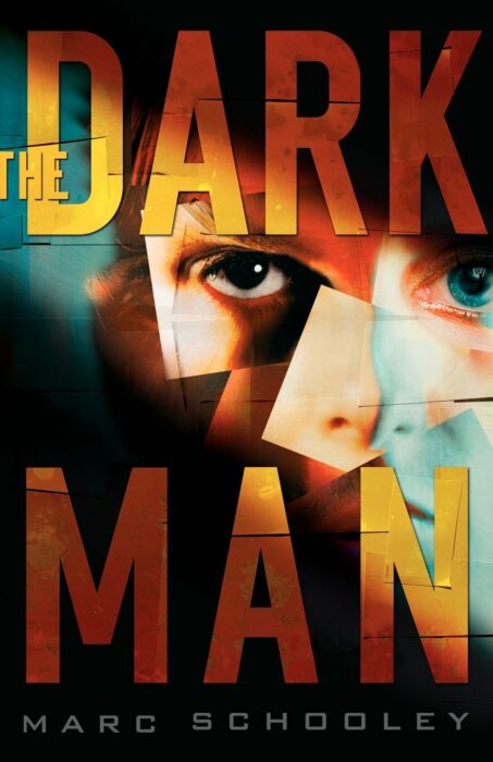
The Dark Man
The world has turned over.
The Dark Man is a near-future thriller about a master of disguise working to eradicate Christianity in America. Charles Graves is haunted by his dead brother, his lost mother, and a phantom arising cryptically from a child’s puzzle.
Charles goes undercover to infiltrate one of the last Christian cells in the South, only to find that someone is working to infiltrate him. In a world turned over by an oppressive government and a godless society, Charles strives to bring down the last Christian leaders.
But sometimes he who persecutes the church is destined to serve her.
















I’m going to say it.
The emperor has no clothes.
Six out of the eight books I’ve read from Marcher Lord Press read like rough drafts or self published books with a low production value sold at retail prices.
And The Dark Man is the worst yet.
The pacing hurt, the voice was inconsistent, and the order of events and scenes was terrible. None of his characters’ motivations were communicated to the reader, and key pivotal moments in characters’ lives happened before the reader ever gets a chance to even know who they are, let alone care about them.
I found myself in the awkward position of hoping against hope that the main character *wouldn’t* get saved in the first moment he’s preached too. Because he was the only fun part of the book, and his slightly-rebellious-because-I-can-do-whatever-I-want-because-I’m-an-awesome-spy thing was the only thing making it work. The Christians weren’t depicted as having anything desirable enough to make me want him to give that up.
Different reviewers mention the book was “not a polished read” or it “pushes literary boundaries.” No, post-modern world, stop being pretentious. This is just bad writing.
But I’m not faulting Schooley. The best writer in the world’s rough draft will read like that. I’m faulting Jeff Gerke for not catching those things. I appreciate what Jeff is doing with Marcher Lord Press. But, I’m sorry, it’s just not quite working.
And The Dark Man, which had a fascinating premise, sadly, is the biggest casualty.
I kind of see what you mean. My ebook versions of The Dark Man and Hero, Second Class are formatted quite badly, with frequent misplaced line breaks.
Maybe I should have complained more in my old review, to be more balanced and honestly critical. I originally wrote that review two and half years ago, and I was a little less cynical then, still just barely clinging to the belief that everything done by Evangelical ministries is noble and awesome, not quite acknowledging my disillusion. Despite my cynicism, I have a natural tendency to try to smooth over disagreements, to be a yes-man. Call that pretension if you want, but I’m still not sure the writing in The Dark Man is just plain objectively bad. But I don’t have the motivation to read it again.
I haven’t been buying all of the MLP books, but I have a feeling that they can’t all have the editing and proofing problems of The Dark Man. I doubt the energy behind A Throne of Bones or the annotated Firebird would have been sustained otherwise. But maybe that’s just me being a yes-man again.
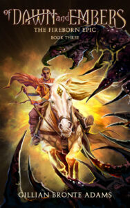
I think part of the key to MLP’s apparent success is that the company gets the “feelies” right. The covers are generally the best out of all the Christian indie POD publishing houses, the website is sophisticated, and several of the books have maps.
The annotated Firebird was basically what Steve Laube had edited with Bethany House. But I hated the cover and the whole production value of the book felt like a giant step down from my original copies from BH, even if it did downplay the romantic look that the old series had. (Kathy Tyers is one of my favorite authors after picking up the Bethany House “Firebird” book one day.)
BUT that said, I was disappointed with Daystar. Just like with The Dark Man, there was pacing and storyline issues. There were elements that should have been a bigger part of the story, and the book its self had too many half story lines that could have been at least two books, not crammed into one, which short changed several elements. Or the scope should have been more limited.
It was Kathy Tyers, but it felt more like a rough draft than the polished books Bethany House had published 10 years ago. And honestly, part of me refuses to accept it as canon. And the other part of me hopes she’ll rewrite it one day and repair the parts that are off.
As for Vox Day, I think his books did get more attention. His cover “Throne of Bones” was also the first design put out by MLP that didn’t scream “self published.”
It’s starting to seem like everyone is excited about MLP is because it’s nerdy, not because it’s putting out a quality product.
Why? What makes all the other covers scream “self published?” If you’re going to imply that people who disagree with your criticisms are pretentious and relativistic, you’d better have some super-objective and enlightened reasons for your criticisms.
I think the design work on the MLP covers tends to be better than average. Maybe the fact that The Dark Man‘s cover is completely graphically designed rather than derived from a painting might make it seem lower budget, but paintings are not the norm for all genres in fiction published by mainstream publishers.
If I really am objectively wrong and have no idea what I’m talking about, I want to know. But the whole “postmodern” criticism can be a cheap way to belittle someone else’s opinion without bothering to provide concrete evidence for yours.
Sorry to be kind of negative in this post…. does this negativity prove that I’m not a Postmodernist? 😉 🙁